
Santa Clara County Public Utility Department
Usability Improvement of Santa Clara City’s Water Utility Service
Primary role:
Product Designer
Time frame:
4 weeks
Industry:
Government Agency
Project Summary:
Re-design project that aims to improve the efficiency of accessing Santa Clara City's website for utility services. This is a 4-week sprint project, and in this case study, you'll find per week deliverables. This study evaluates the usability of utility services on the existing website and provides constructive suggestions to improve them. It covers the initial cognitive walkthrough of the website to the final clickable hi-fi mockups. Users had to visit 57% fewer pages to start a new service in the new design. As well as, 59% users clicked on the newly added "Start New Utilities button", one of the major design decisions made.
Overview
Let's talk impact
To find solutions to challenges like gender-based violence, reproductive rights, pay equity, digital and financial literacy, and more to help women of color or non binary individuals by harnessing cutting-edge technologies like AI, blockchain, and 5G.


“I made this selection because when I scroll down the page, I can clearly see the opion of Starting the New Service, and as this page is about the Utilities Services, so I think that clicking on this selection, it will start a new Utility Service for my home.”

Usability Tester

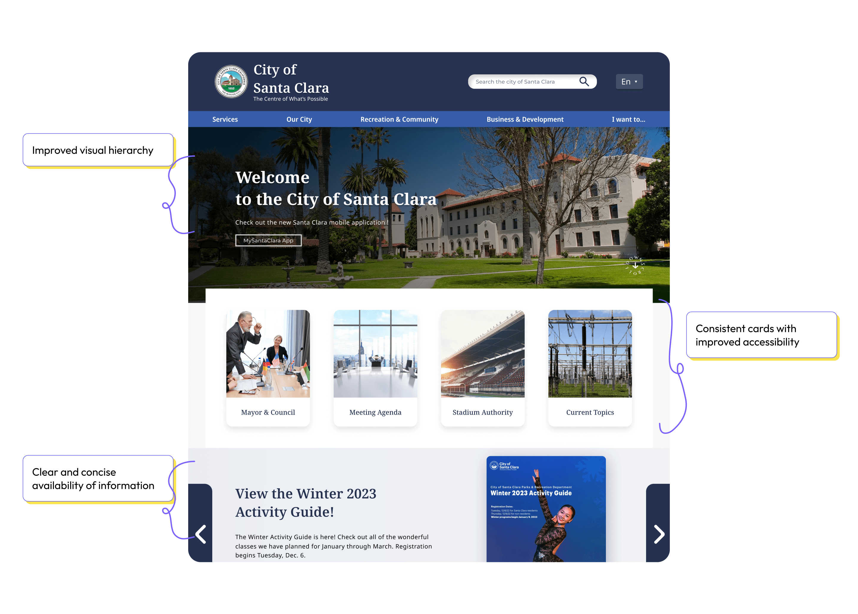
Our users required clearer navigation to the utility service offered by Santa Clara County. The "Services" section was disorganized, users felt lost and confused. It was time-consuming to understand the process at once. This was when I realized I should put on my designer hat and started to revamp Utility Service Feature.

Task Failure
User research shows that more than 80% of users who first attempted to use the city's website to start a new water service failed the task

User Frustration
Users felt frustrated and preferred calling the department directly to start a new service

Increased Calls
Increased calls adds additional load to the city's customer service department for a task that could be done much faster online
Redesigning the city of Santa Clara’s utility services website to be more intuitive and easy-to-use for new residents will improve usability, reduce customer service calls, and increase confidence, and positive sentiment toward the public utility department
I followed the Human-Centered Design process, taking me 4 weeks sprint to progress from the 'Relate' to the 'Test' phase
Week 1
Understanding Users pain-points and frustrations through research
Week 2
Recommend UI fixes based on Heuristic Evaluation of existing website
Week 3
Usability improvements by creating initial sketches and design iterations
Week 4
Implementation of recommendations on final design and user testing
Understanding Users pain-points and frustrations through research
Issue #1
Task Flow
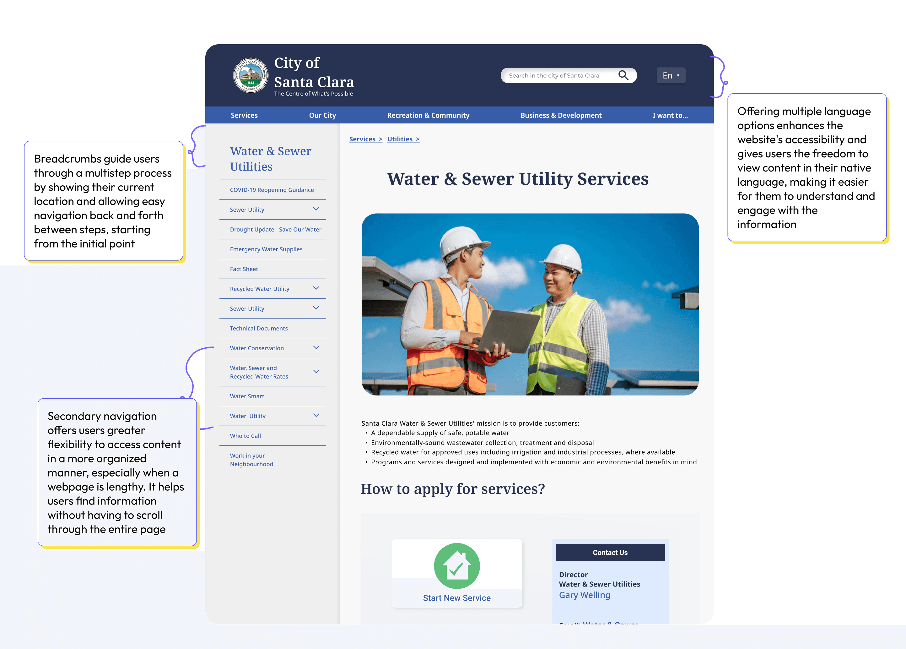
Water utility page provides general information about city’s water service but doesn’t include options to start a new utility.
Issue #2
Navigation System
Navigation options don’t clearly include starting a new utility service and are misleading. User's find it to be very text-heavy.
Issue #3
Content Organization
Some images are not relevant to the text, are very random or out of context, are very distracting, and do not let users focus on the task they want to accomplish.
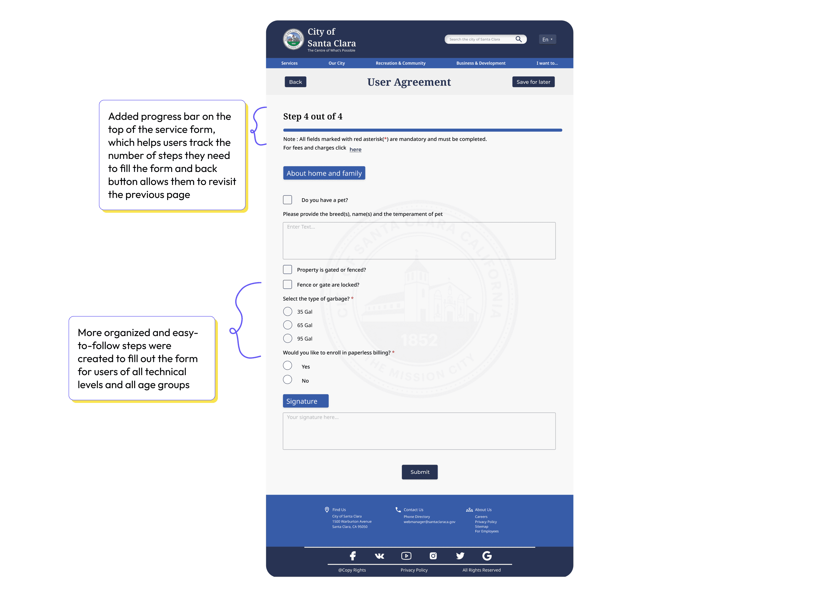
57% reduction in pages to navigate for starting a new utility service
Analyzing user feedback, the first item I wanted to optimize was the user flow. After multiple iterations, I reduced the number of pages users have to visit to start a new water utility from 7 to 3.
Recommend UI fixes based on Heuristic Evaluation of existing website
This week covers analyzing the existing website and assessing it with Neilsen's Usability Heuristics. This helped me to assess the current website's navigation, its usability, and accessibility. After the evaluation of the website based on the issues, I recommended suggestions for fixes for the experience as well as for the interface.
Consistency and Standards
Aesthetic and Minimalist Design
Visibility of System Status
Usability improvements by creating initial sketches and design iterations
This week covers designing new wireframes to improve the usability of the website and make it easier for the user to complete the task at hand.
For this, I started with creating (lots of!) sketches for mobile, it’s good to design mobile first.

Implementation of recommendations on final design and user testing
CLARO'S page final design
Campaigns page final design
Campaigns page final design
Campaigns page final design
Streamline Funding
CLARO'S page final design