Human Agenda
Redefining Legal immigration services and increasing conversion rate of donation by 42%
Primary role:
Time frame:
Industry:
Responsibilities:
Results:
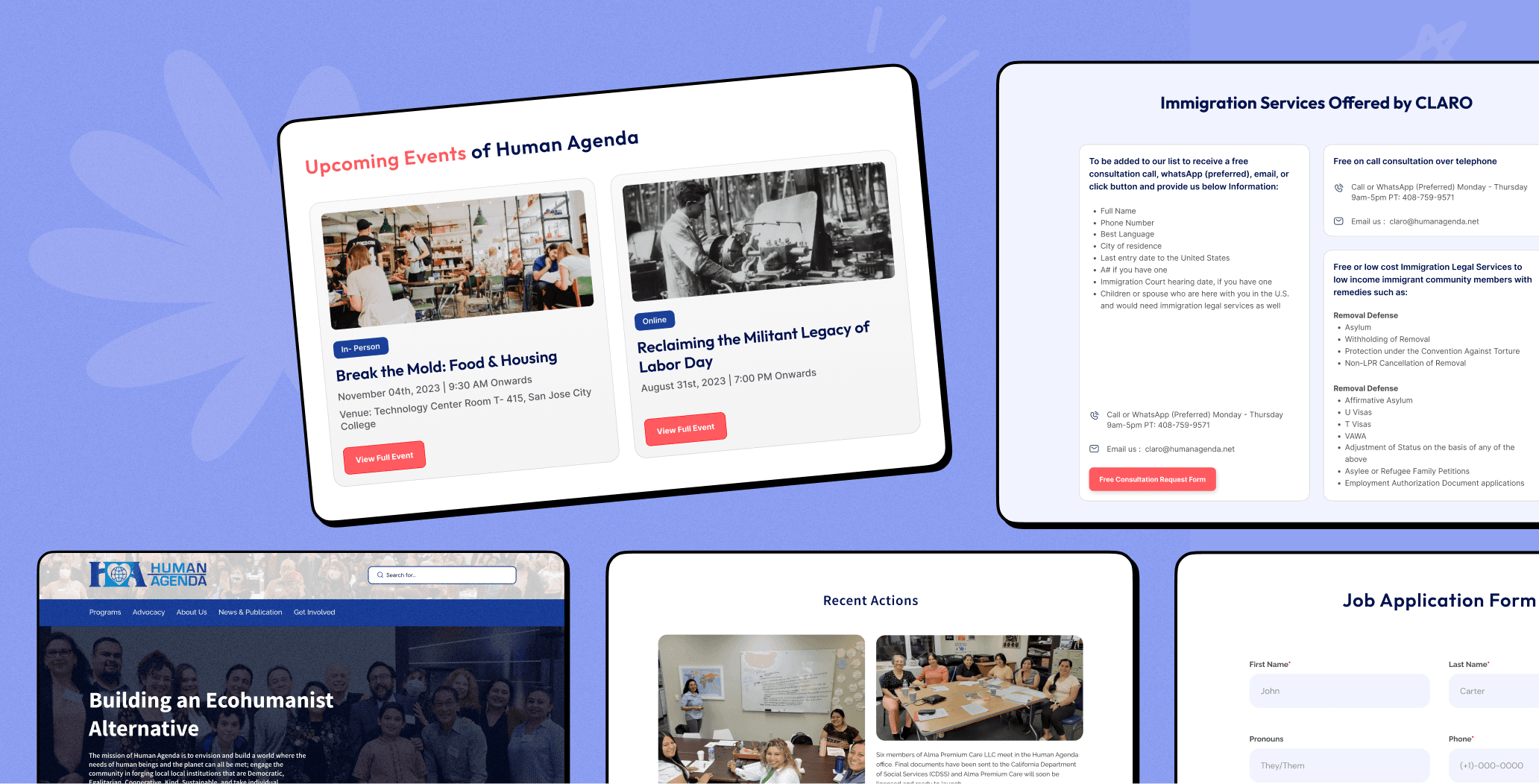
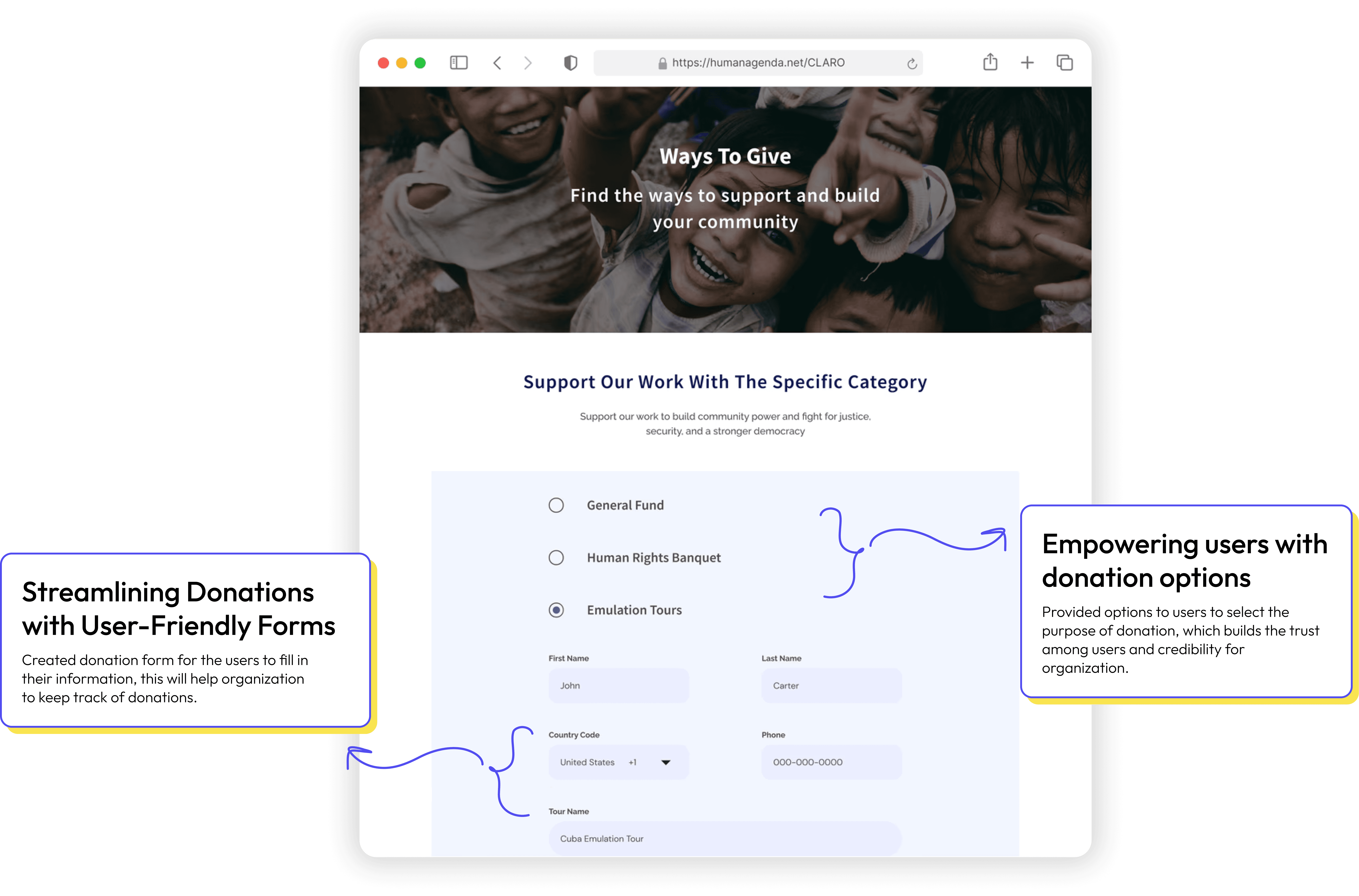
The redesigned website features a clean, clutter-free interface, making it easier for users to navigate and access Human Agenda's services. The improved donation process resulted in a 42.1% increase in the conversion rate of donation button. The new interface enhanced user engagement, leading to a 17% decrease in user exit rate.
Impact


Immigrants need reliable immigration services
Human Agenda is an organization dedicated to providing no-cost immigration consultations and educational resources to low-income immigrants. CLARO is a democratically run organization within Human Agenda that provides free and low-cost legal services to low-income immigrants.
Human Agenda is on a noble mission, but its existing website is very static and inaccessible. This makes it challenging for users to retrieve the information they need as well as for the organization to update the content on their website.
“Human Agenda's existing website looks like a pdf document.”

Human Agenda's mailing list subscriber
Problem Statement
Human Agenda's website needs revamp to aid immigrants in accessing affordable legal and community support, aligning with their mission to provide quality immigration services for all.
Key issues prompting website redesign
Based on user feedback and UX audit on the existing website, I listed down major key issues that were making the website inaccessible for the users.
In my redesign initiative, I made sure to address these components while preserving the fundamental principles at the heart of Human Agenda.
Bridging the gap between the business goals and user needs
Before working on the website’s design, I wanted to dive into the business needs and expectations early. Since the organization handles sensitive legal information of the users, I could not conduct the in-depth user research that I wanted to.
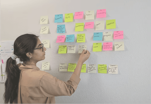
Research was focused on understanding the stakeholders and their requirements from the new website.
After gaining comprehensive understanding of the business, I identified three primary goals. These goals emerged as significant pain points for both users and the business.
I decided to prioritize these three flows as the initial focus of efforts
New navigation system and content design
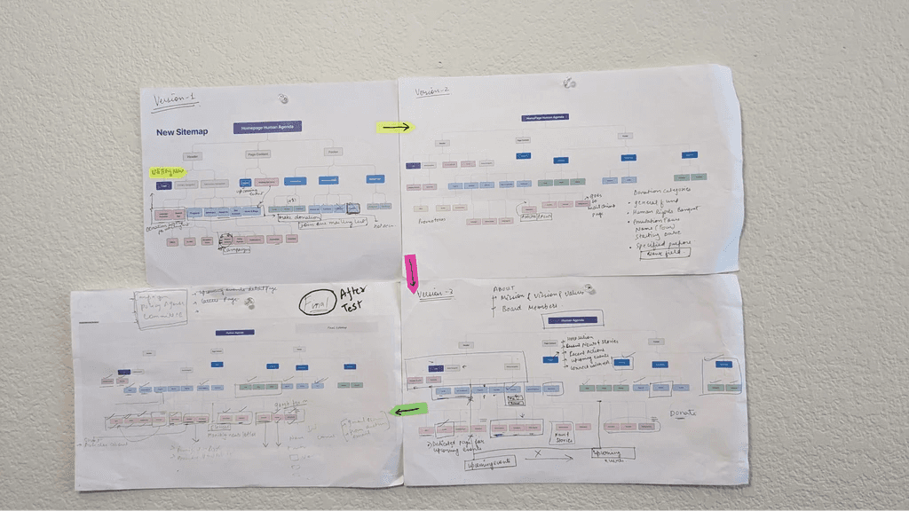
I conducted a comprehensive assessment of the website's sitemap. The new Information Architecture is designed to match users expectations and business goals:
Do our labels make sense?
71%
users found these labels intuitive and were able to locate the direct corresponding actions.
Are the users having difficulty in finding tasks?
17/30
users find it very difficult to locate the upcoming events.This indicates that there may be usability issue and required a fix.
Can the users easily navigate through the sitemap?
77%
users were easily able to navigate through the website’s site map.
Initial sketches helped me in connecting site’s IA to its visual design by showing path between pages
Initial sketches (brain dump) of home page and claro's page
Initial sketches (brain dump) of donation page
Solutions for the preset goals
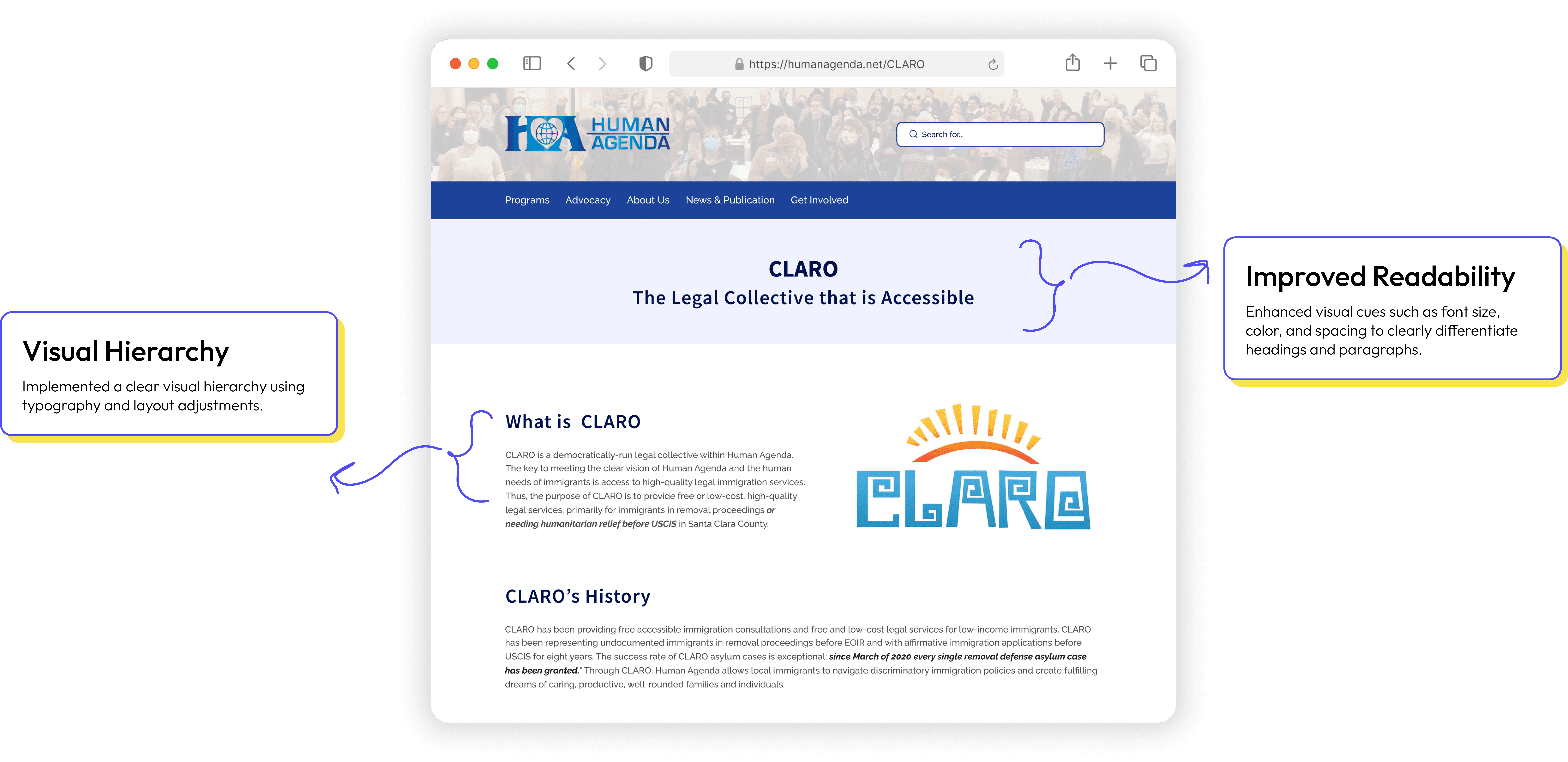
CLARO'S page final design
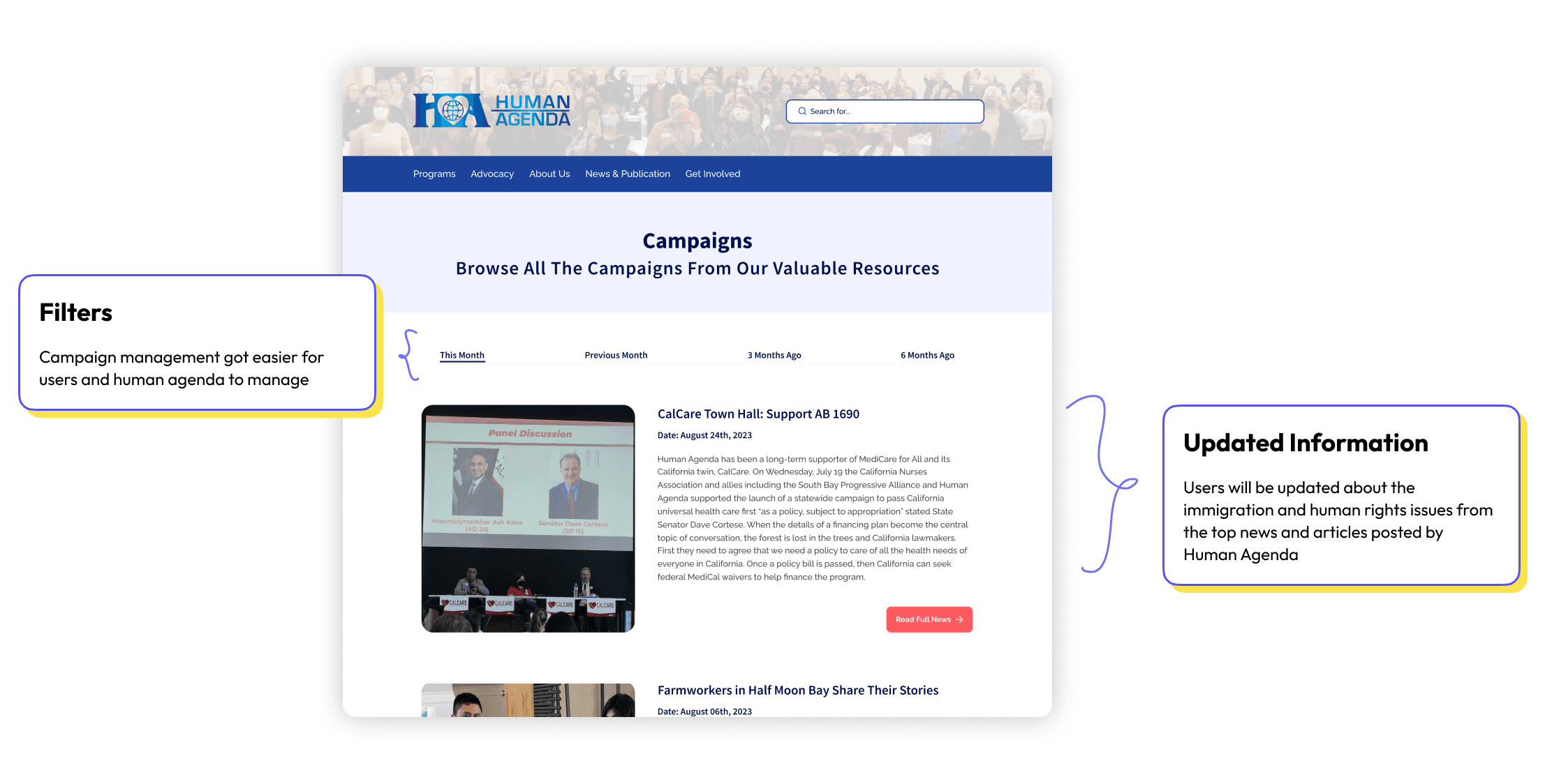
Campaigns page final design
Donation form final design
Streamline Funding
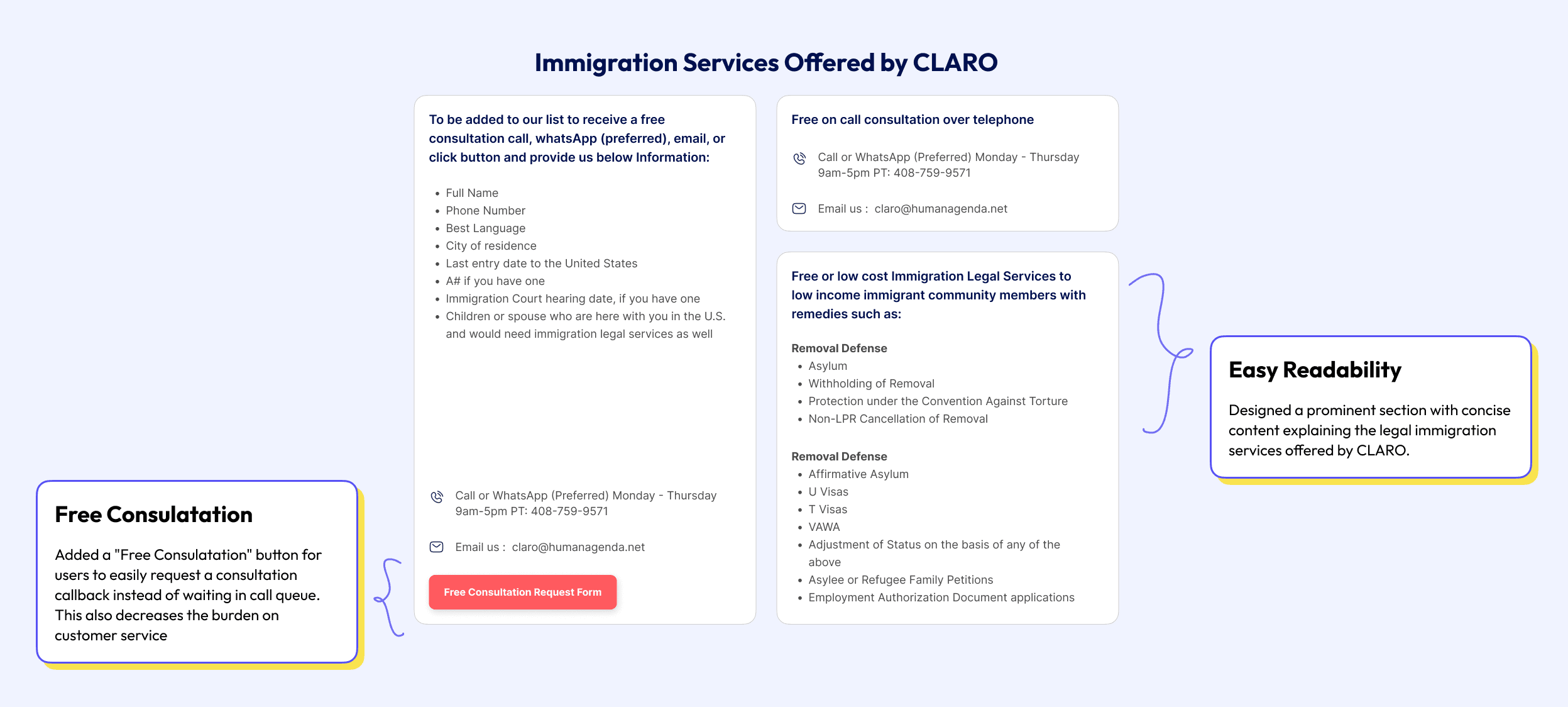
CLARO'S page final design
